Understanding the Candlestick chart

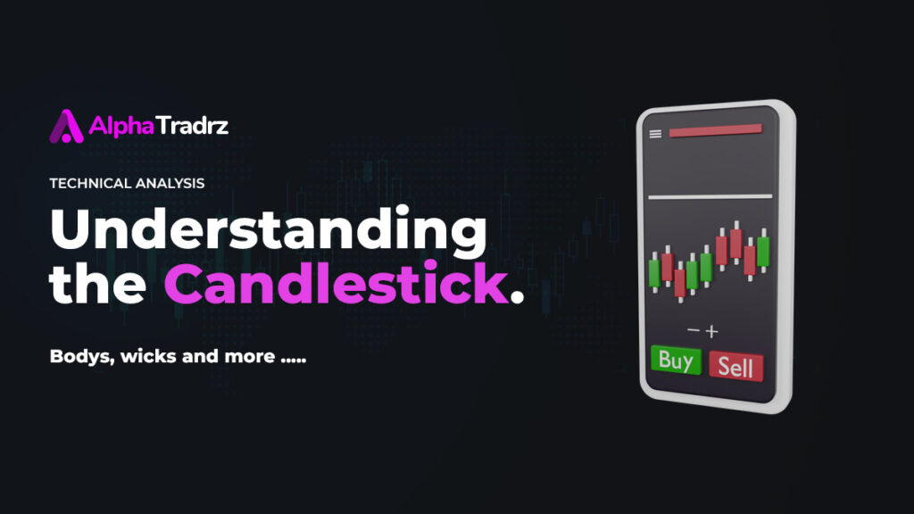
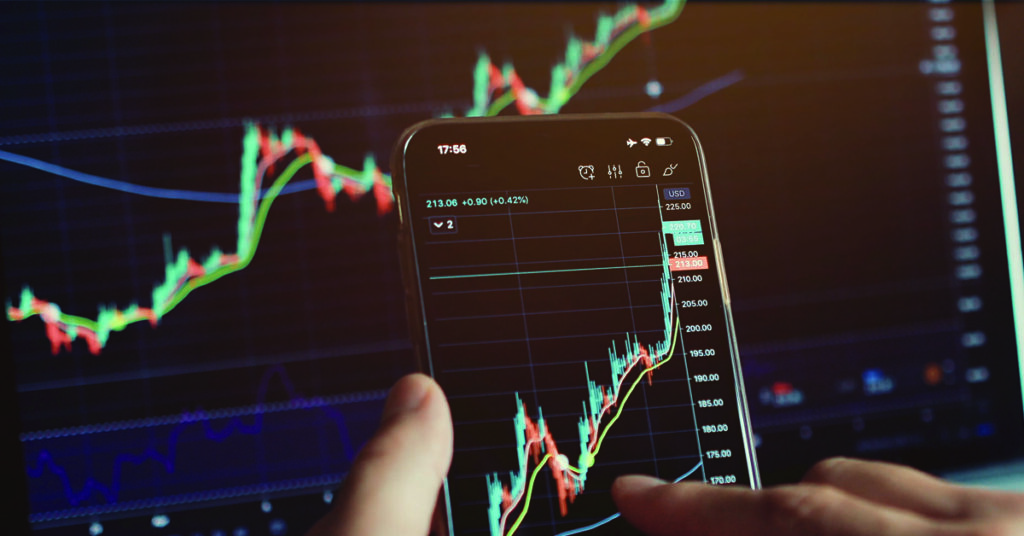
A candlestick chart is a widely used graphical representation of price movements in financial markets, such as stocks, commodities, currencies (forex), and cryptocurrencies. It provides valuable information about the price action of an asset over a specific time period and is particularly popular among technical analysts and traders for its ability to convey a wealth of information in a visually intuitive manner.
Here’s an explanation of the key components of a candlestick chart:
Candlestick: Each candlestick on the chart represents the price movement for a specific time frame, such as a minute, an hour, a day, a week, or any other chosen interval. It consists of three main parts:
Body: The rectangular area between the open and close prices during the given time period. If the close price is higher than the open price, the body is typically filled (colored) or represented as white, indicating a bullish (upward) price movement. If the close price is lower than the open price, the body is usually filled or colored black, red, or another bearish (downward) color.
Wick (or Shadow): The thin lines extending above and below the body represent the high and low prices during the time period. The upper wick extends from the top of the body to the high price, while the lower wick extends from the bottom of the body to the low price.
Bullish and Bearish Candlesticks: Depending on the relationship between the open and close prices, candlesticks can be classified as follows:
Bullish Candlestick: The close price is higher than the open price, indicating bullish sentiment. In this case, the body is typically filled or colored white or green.
Bearish Candlestick: The close price is lower than the open price, suggesting bearish sentiment. The body is typically filled or colored black, red, or another bearish color.
Time Frame: The user can choose the time frame for each candlestick, such as 1 minute, 15 minutes, 1 hour, daily, weekly, etc., depending on their analysis or trading preferences.
Candlestick charts provide traders and analysts with several advantages:
Visual Clarity: Candlestick patterns offer a clear visual representation of price movements, making it easier to identify trends, reversals, and potential trading opportunities.
Information Density: Each candlestick encapsulates the open, close, high, and low prices for a specific period, condensing a significant amount of data into a single, easily readable form.
Pattern Recognition: Traders use various candlestick patterns (e.g., doji, hammer, engulfing patterns) to make informed trading decisions based on historical price behavior.
Support and Resistance: Candlestick charts help identify key support and resistance levels, which are essential for technical analysis.
Trend Analysis: Candlestick charts enable traders to assess the strength and direction of trends, facilitating trend-following or trend-reversal strategies.
While candlestick charts are a powerful tool for technical analysis, they are best used in conjunction with other technical indicators and analysis methods to make well-informed trading decisions.


Responses